
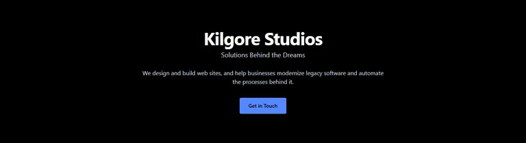
We started the home page hero with a rough first pass: a centered "Kilgore Studios", the tagline under it, one sentence about what we do, and a button. It was readable and told a visitor nothing about the work.
We improved it in rounds: the layout first, then the picture, then the details.
Three directions
We kept the black background and blue accents and added a wall of code behind the page, drawn as SVG. Then we tried three layouts for it.
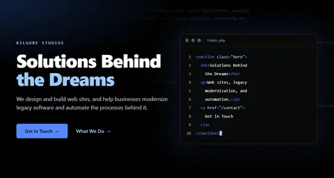
The first, "code horizon", tilts the code back like a floor that fades into a blue glow. The second, "source view", sets the headline on the left and a code editor on the right showing the hero's own markup.
The third, "big type", sets the tagline at 128 pixels in the heaviest weight, with the code wall tilted behind it on the right.
 Code horizon
 Source view
 Big type
We liked big type with the code wall. We did not want the company name or the tagline as the giant headline, so we asked for imagery in that spot instead. Both are already in the header.
Four pictures
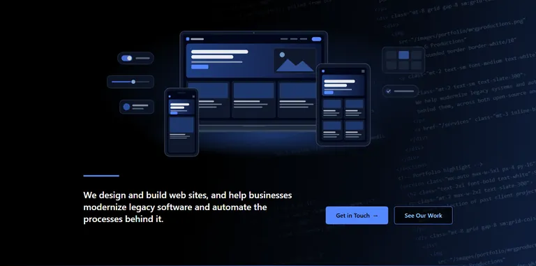
We drew four options, each at the same size so they could be swapped without moving anything else. Floating windows shows a site being designed next to its code and an app dashboard. The device set shows one small site on a laptop, a tablet, and a phone. The isometric stack draws four layers of a project: hosting, data, code, and design. The automation flow runs from an old terminal through a few process steps to a modern dashboard.
 Floating windows
 Device set
 Isometric stack
 Automation flow
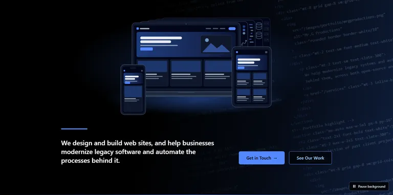
We picked the device set, and liked the stack because it showed everything we do. So we combined them: the devices in front as finished products, with the stack layers behind them, quiet enough that the screens stay the focus. We drew the layers as flat sheets fanning out behind the laptop, since isometric slabs next to front-facing devices mixed two drawing styles.
Rounds of adjustment
We wanted more of each sheet to show, about twice the strip, and a few small widgets on the empty left side.
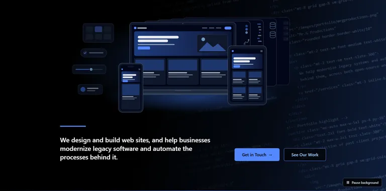
The left side then looked busy against the devices, so we dropped one widget and spaced the other three evenly. We also removed the design sheet and kept code, data, and hosting. The hosting sheet was nearly black, so we lightened its body and gave the racks a brighter outline. Its outline against the page went from 1.25:1 to 2.16:1, and the rack outlines against the sheet from 1.13:1 to 3.15:1.
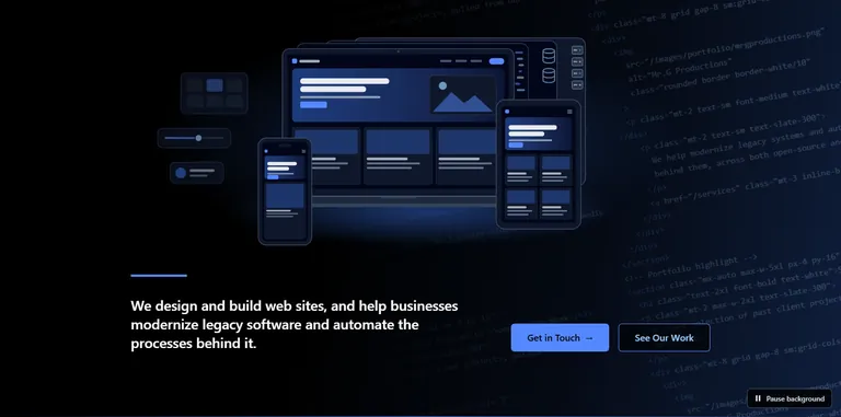
The last round made the three sheets show the same amount (52 units each in the 1300-unit drawing, about 40 pixels on a wide screen), centered the database icons, widened the server racks from 24 to 36 units, and set the HTML tags in the code wall in bold. The bold is faint because the wall is tilted and dim, but it adds some texture.
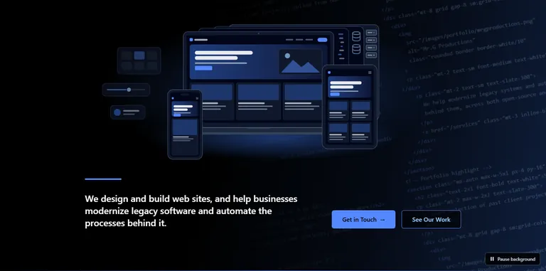
Limits we kept
Contrast
We hold text to WCAG 2.2 AA, which is 4.5:1 for normal text. Code behind text is the risk, so we computed the worst case by putting the brightest part of the wall, under the blue beam, behind every pixel of text. The headline still reaches 8.71:1 there. Measured on the rendered page at 1440 pixels wide it is 18.9:1. The art itself never sits behind text. It is an image above the headline, and we checked at five widths from 320 to 1440 pixels that no line of text overlaps it.
Motion
The code wall moves one 600-pixel tile every 80 seconds, about 7.5 pixels per second. A "Pause background" button stops it, and its label changes to "Play background". With reduced motion set in the operating system, the wall stays still and the button is hidden. Without JavaScript the wall also stays still.
One visible heading
The sentence under the art is the page's h1. We did not use a hidden "Kilgore Studios" heading, because sighted keyboard and voice users would not see what screen reader users hear.
Drawn, not photographed
The art is original SVG, about 12 KB (2 KB compressed), and the code wall is another 5 KB. They stay sharp at any zoom, and no text sits inside an image.